WMWE Website
Founded at the University of Texas at Dallas in the summer of 2016, Women Mentoring Women in Engineering is a mentoring program that fosters mentorships between students of UTD and working women. Students are paired up with professional women currently working in the technology industry or in academia to be mentored for a semester and build a relationship with those familiar with the working environment.
In an effort to improve their online presence and keep up with exponential growth, Women Mentoring Women in Engineering recently underwent a rebranding effort that included updating their social media accounts and valuable documents. However, their website was left behind, with an outdated design and incomplete information. As the organization continued to grow, it became clear that the website needed a complete overhaul to provide visitors with all of the necessary information, including sponsorship details, mission statements, and contact information.
OVERVIEW
ROLES
UX Designer
Full-Stack Web Developer
TEAM
Vyshnavi Nalla
Sanjana Jadhav
TOOLS
Figma
React.js
Node.js
Firebase
TIMELINE
Ongoing
PROBLEM
How can we revamp the Women Mentoring Women in Engineering website to accommodate their growth, enhance their online presence, and provide visitors with comprehensive information and a better user experience?
USER RESEARCH
After sitting down with my development team, we fully expected to be able to complete this project in a matter of weeks. Once we finally got to clicking through the current website, though, we realized we had quite a lot in store for us. Without consistent maintenance of the site's content, the website was filled with old information and broken links, and finding a place to start was just about as difficult as finding a single page that was up to date. So, to start, we decided to pull from our experiences as officers and mentees within the program. Then, we conducted a series of interviews with officers, mentees, and mentors to get a better understanding of our updated priorities, and identified 3 target areas of improvement.

Our old website, featuring too much whitespace and an officer board long graduated :(
🎯 HOW MIGHT WE INCREASE ENGAGEMENT WITH A SINGULAR PLATFORM?
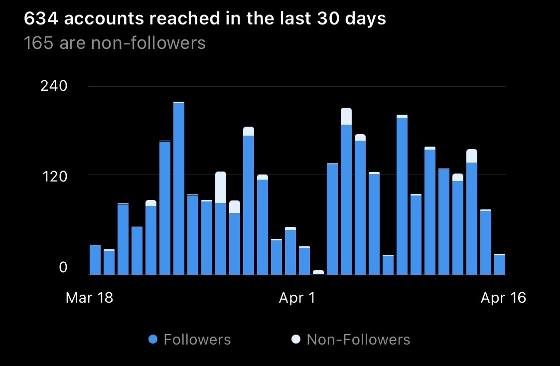
Being a marketing officer for a rapidly growing organization is no easy feat. As each new semester rolls around, it brings with it a fresh batch of mentees, mentors, and events that require weekly promotion. Juggling so many moving parts can make it all too easy to forget important tasks, like posting flyers on LinkedIn or keeping in touch with potential new members through Instagram DMs. Unfortunately, this problem doesn't just affect our officer board — it also has negative consequences for our mentees. Many interested new members and current members have been driven away by the sheer difficulty of trying to keep up with content spread across multiple platforms.

A peek into what "normal" engagement looks like for a student organization...
🎯 HOW MIGHT WE PERSONALIZE THE MENTORSHIP EXPERIENCE?
With WMWE's rapid growth, keeping track of the old and the new is something that our old website did not do well. As a very niche organization, we strived to create personal connections with mentors and mentees alike, but with no way to easily access a list of current members, it was difficult to keep track of who was who. For our mentors, we had to rely on Linkedin profiles and their short application responses, while for our mentees, we had almost nothing to go off of apart from their names and majors. Without any of this information, the disconnect throughout WMWE became prominent and it turned out to be hard — for not only us, but mentors and mentees — to pick up a conversation with someone who they had no knowledge of. Many mentors were even remote, so being able to connect with them on a personal level was even more difficult when we could hardly find their contact information.
🎯 HOW MIGHT WE FACILITATE FASTER COMMUNICATION ACROSS WMWE?
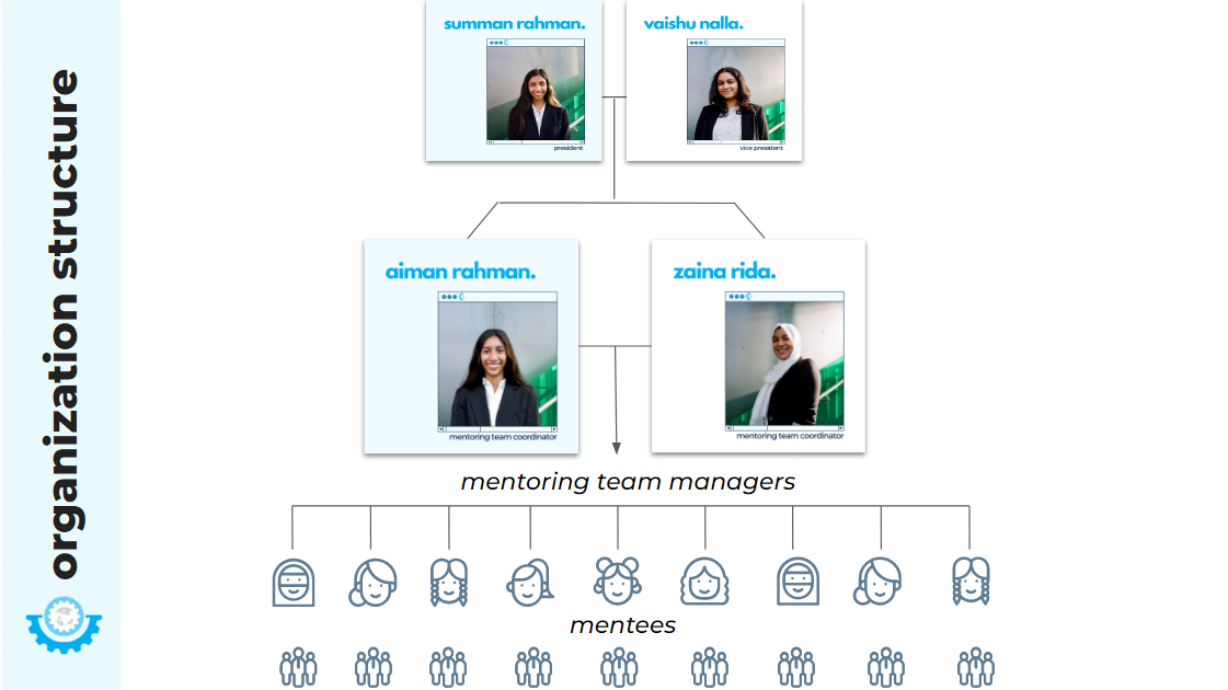
With WMWE being so involved in the industry and in the student body, we have a strong heirarchy that helps us organize different aspects of the program, including outreach, marketing, events, and program coordination. However, with so many different people involved in the organization and various individual spreadsheets keeping track of endless information, there is no single place where we can communicate to students. What's worse? Our mentees themselves didn't know how to reach us directly, and instead communicated through an assigned Mentoring Team Manager, who then had to grab a coordinator's attention, and only then would we as an executive team be able to respond. Many of us officers went unnoticed as a result, and though it kept our team structured, it also meant conflict resolution and necessary communication took longer than expected.

The WMWE pyramid, presented to mentees at orientation. Looks simple, but with 130+ members, it gets a lot harder...
IDEATION
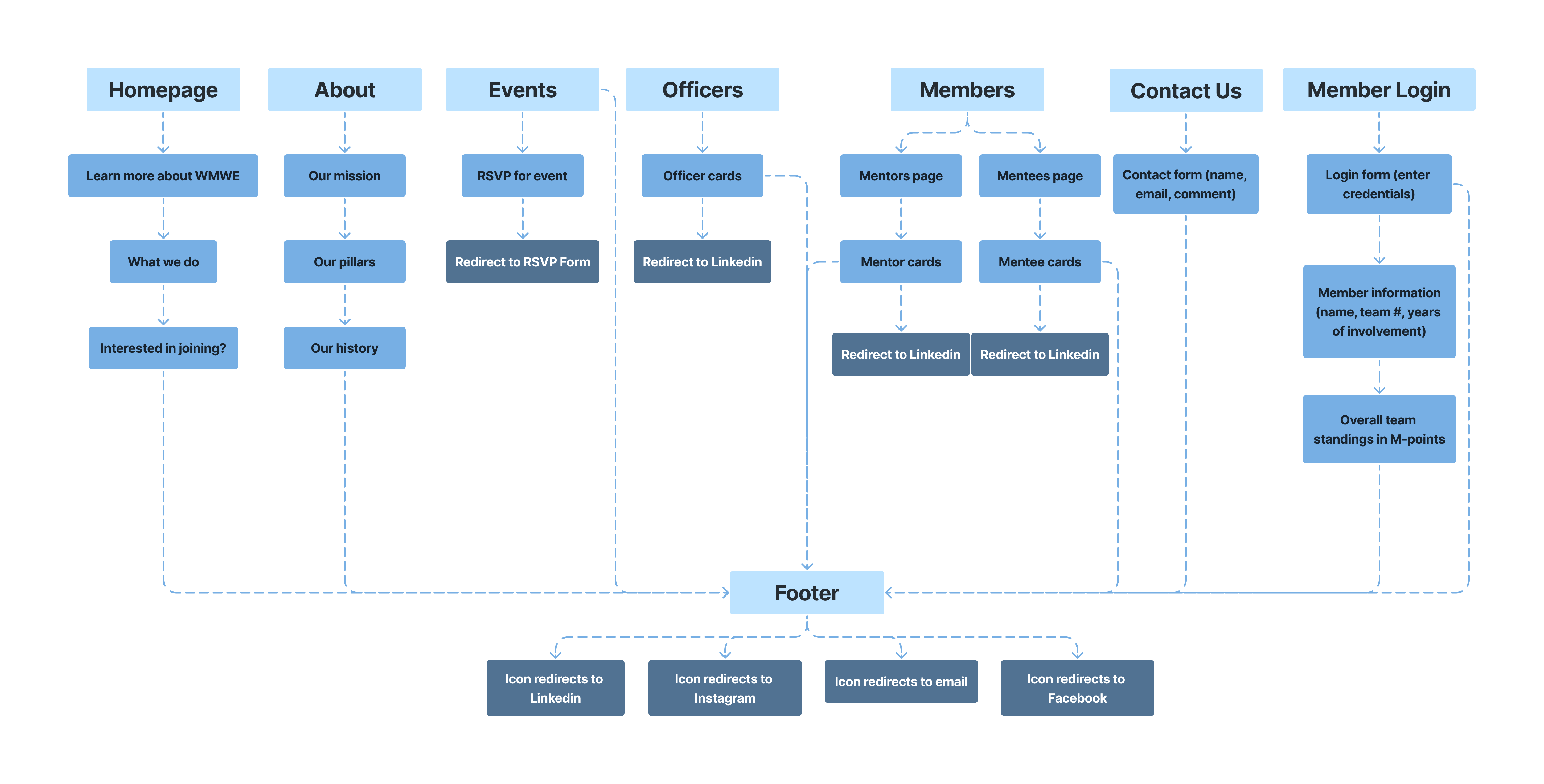
Rather than jumping straight into the design process, we decided to take a step back and understand how we could best ensure each problem got an equal amount of attention on the website. We started by creating a flowchart and hashing out the information architecture.

OUR FAVORITE PART...BRANDING!
One of the major issues both my team and many of the people we surveyed picked up on was the lack of cohesion across our social media platforms. By using a website builder, we were limited to the handful of fonts and font sizes that were available. However, now that we were coding from scratch using React, we could replicate the branding and automatically accomplish one of our targets for the website.
HI-FIDELITY WIREFRAMING
Once we fully understood the information architecture and defined our branding, we started to create a set of wireframes for our website. We originally
tried to stick to our social media's branding, which was more playful, and tried to embrace vibrant colors. However, the designs
we created, from a developer's standpoint, was not at all responsive or adaptable for future changes.
We switched gears to a more minimalistic design, which was much more flexible and allowed us to focus on the content
instead of the design, which had been another one of our major priorities in the earlier stages of the project.
DEVELOPMENT TIME!
Once we had a design and architecture, we started to code! We used React to create our website,
and split up the work. I got the chance to on the About page,
members page (added all 100+ of our mentees and mentors!), officers page, and the inital iterations of the
navigation, footer, and sign-up/login pages.
We experimented quite a bit during this period, debating the use of several Google APIs and different ways to push Firebase's limits with how
much user data we could use to automate our website.
As we've continued this project, we've all settled into our own roles — I took more of a lead on front-end development and working on
making the website responsive. As of now, we are each wrapping up our separate tasks, and are working together to integrate our work and
discuss a timeline for how the website will continue to be maintained.
CORE FEATURES
💡 ACCESS ALL SOCIAL MEDIA PLATFORMS AND CURRENT ACTIVITY
The Home page of WMWE serves as a central hub for all related engagements and resources, making it easy for members to access information and get involved. Its user-friendly design, which incorporates interactivity and relevant links, helps to increase engagement and create a more connected community. Additionally, the Home page's integration with social media platforms expands and streamlines the organization's reach and attracts new members.
💡 VIEW CURRENT MENTORS, MENTEES, AND OFFICERS AND THEIR EXPEIRENCES IN THE INDUSTRY
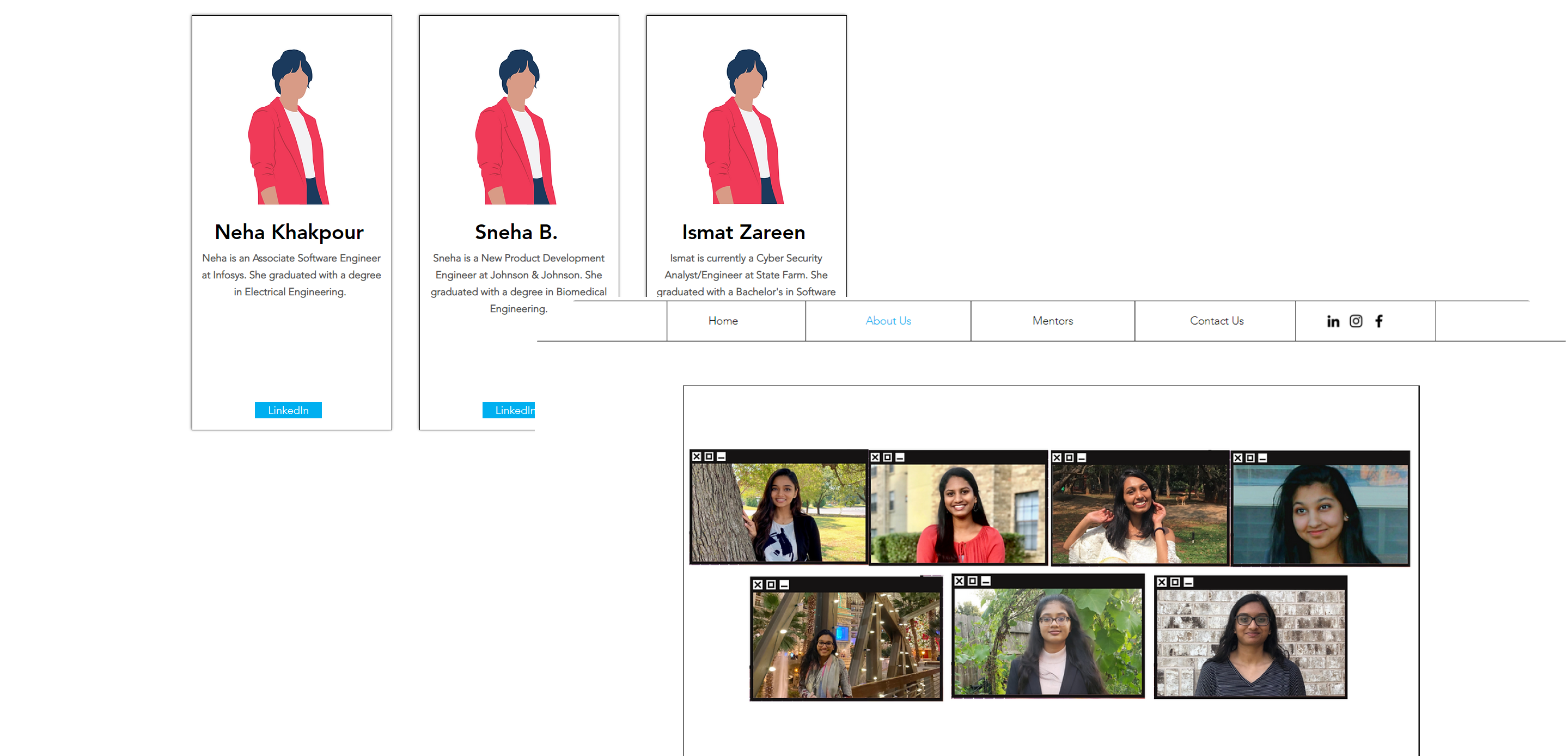
The Members page is a vital component of WMWE's community. By providing users with the ability to toggle between mentors and mentees, it allows members to connect with those who have similar interests and experiences. Additionally, members can access fellow members' LinkedIn profiles and a brief description of their past experiences and current occupations, providing them with valuable insights into each other's professional backgrounds.
💡 VIEW TEAM AND INDIVIDUAL PROGRAM DETAILS
The WMWE portal provides users with a comprehensive overview of their standing in the organization, featuring their current team, role, and the number of years of engagement. Through the portal, they can also access their team standing and the number of points they have earned from attending events or hosting mentor meetings. Members can now skip the tedious process of contacting their mentoring team managers to check their standing and instead access this information at the click of a button.
PERSONAL TAKEAWAYS
As the project is still ongoing, we have not yet fully observed the impact of the website on our organization. However,
technically speaking, the WMWE website offered me a chance to gain hands-on experience with Figma, React, Node.js, and Firebase, and to see
how version control tools like Github operate in a professional setting.
Of course, being a freshman when this project started meant I came across challenges that my teammates had overcome their
own freshman year. I learned how to work with a team of people who have unique skillsets and gained a better understanding of
how to communicate effectively, especially with the technical obstacles we faced.
As this project comes to a close, I am excited to see how the website will impact our organization's internal and external
structure, and I am grateful that a project like this allowed me to engage more with the amazing community at WMWE and soon,
will allow so many others to do the same.